Market data · Design system · Product UX
2026
algoseek
Building a coherent interface foundation for complex market data workflows.

Client
Algoseek LLC
scope
Market data · Design system · Product UX
year
2026
duration
5 month
Overview
The brief.
Volta Studio came to me with a clear problem — they had strong work but a brand that didn't reflect it. Their existing identity was generic, forgettable, and said nothing about what made them different from every other creative studio competing for the same clients.
The brief was to build a brand identity from the ground up — a visual system that felt bold and confident without being loud, that communicated craft and precision, and that could scale across print, digital, and motion without losing coherence.
The Challenge
Make complex choices understandable
Market data requests can involve coverage, time ranges, symbol scope, aggregation, delivery, and agreement details. Each choice changes the request a customer makes and the information a team needs to process it. An interface that simply exposes every option at once shifts that complexity onto the user; inconsistent patterns across screens make it harder to see what a field means or which stage an order has reached.
The challenge was to make these decisions legible without hiding the real depth of the product, while giving designers and engineers a dependable system for adding features.
the solution
A system before a collection of screens.
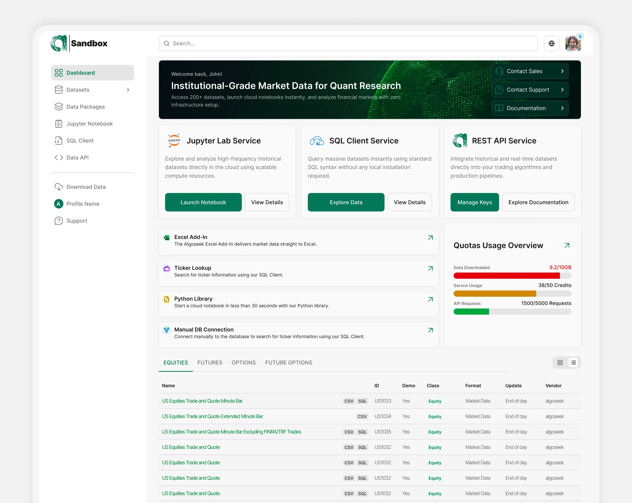
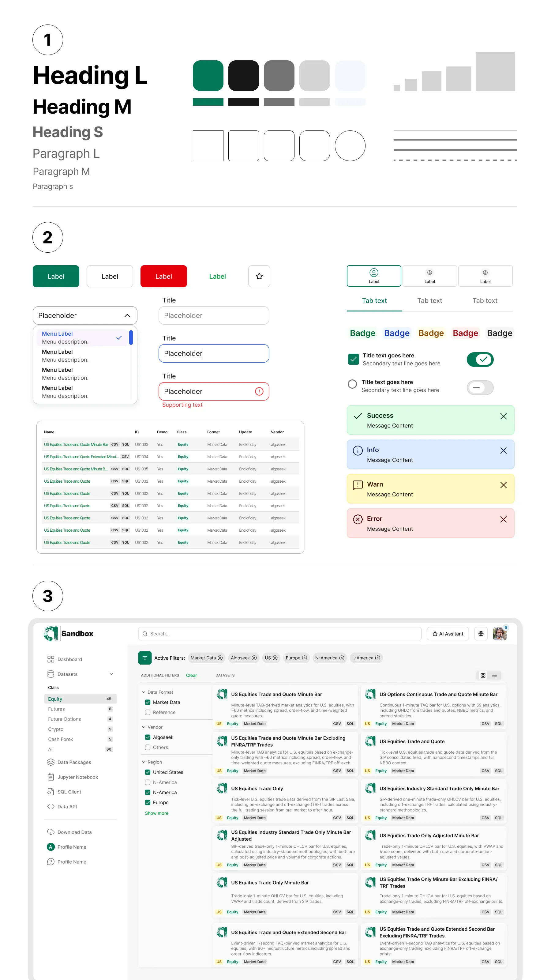
I defined typography, semantic colour, spacing, and reusable patterns in Figma, then built components for navigation, forms, cards, tables, tabs, dialogs, and feedback. I documented their variants and usage so teams can repeat a decision without copying a screen by eye. The system covers loading, empty, error, validation, success, disabled, and confirmation states as part of the component design, not as an afterthought.
Progressive request configuration. I designed the request flow around the order in which a customer makes meaningful choices: the dataset and data scope, relevant time period and aggregation, then delivery and review. Conditional fields appear when they are relevant, with help and validation close to the decision they explain. The review step makes the selected scope visible before submission.
A clearer operational lifecycle. I worked on views for requests, orders, and agreements so status, permitted actions, and important details can be read in context. Dense records need hierarchy: summary first, detailed terms and history where needed. Tables and forms reuse the same patterns, while the content reflects the specific data task.
A website that leads into the product. I also worked on presenting datasets and product capabilities on the web. The visitor should understand what data is available and how to move toward a relevant request, while the application follows through on that promise.
Outcome
The work produced a shared Figma design foundation, documented interface patterns and states, and designed flows across customer-facing and operational experiences. It gives the team a consistent language for discussing and building new features. This case represents design work and deliverables; it does not claim a measured commercial result or that every illustrated flow has shipped.
What this case demonstrates: building a design system from zero alongside the product, and using it to clarify a domain where data detail cannot simply be removed.

